Introduction

To explain the implementation of Vue.js component events and emit, it’s essential to first understand the application of component events and emit. This will provide a clearer understanding of how component events and emit are implemented.

For component events, we’ve previously discussed the browser’s event mechanism:

Browser Event Review

Browser events refer to various signals of interaction and state changes that occur on a web page. These events can be triggered by user actions, changes in the browser’s state, or other factors. Here are some common DOM events and their descriptions:

Mouse Events:

  • click: Triggered when the mouse clicks on an element. For touch-screen devices, it’s triggered when there’s a tap on the screen.
  • contextmenu: Triggered when the right mouse button clicks on an element.
  • mouseover / mouseout: Triggered when the mouse pointer enters or leaves an element.
  • mousedown / mouseup: Triggered when the mouse button is pressed or released over an element.
  • mousemove: Triggered when the mouse is moved.

Keyboard Events:

  • keydown and keyup: Triggered when a key is pressed down or released.

Form Element Events:

  • submit: Triggered when a visitor submits a <form>.
  • focus: Triggered when a visitor focuses on an element, such as an <input>.

Document Events:

  • DOMContentLoaded: Triggered when HTML is fully loaded and processed, and the DOM is completely constructed.

CSS Events:

  • transitionend: Triggered when a CSS animation is completed.

These events can be captured and processed using event listeners in JavaScript. By adding event listeners to elements, specific code can be executed when certain events occur. Events form the foundation of interaction and responsiveness in web development.

Now, how does component events differ from browser events?

In the context of events, we can understand them as specific occurrences at a given point in time, signaling that something has happened. An event is a signal that can be received and processed, and that’s what events are.

In the case of component events, it refers to the communication between Vue components, achieved through events. In this context, events serve as a means of communication between components, and this communication is implemented using events. Here, events specifically refer to what we call component events.

The primary mechanism for communication between Vue components using events is through the use of the emit and on methods. When a child component needs to communicate with a parent component, it triggers an event and uses the emit method to send the event. The parent component, in turn, uses the v-on directive in the template to listen for this event and execute the corresponding logic.

<!-- Child Component ChildComponent.vue -->
<template>
  <button @click="sendMessage">Notify Parent Component</button>
</template>

<script>
export default {
  methods: {
    sendMessage() {
      // Use emit to send a custom event
      this.$emit('child-event', 'Hello from child!');
    }
  }
}
</script>
<!-- Parent Component ParentComponent.vue -->
<template>
  <div>
    <child-component @child-event="handleChildEvent"></child-component>
    <p>Message received from child: {{ messageFromChild }}</p>
  </div>
</template>

<script>
import ChildComponent from './ChildComponent.vue';

export default {
  components: {
    ChildComponent
  },
  data() {
    return {
      messageFromChild: ''
    };
  },
  methods: {
    handleChildEvent(message) {
      // Listen to the child component's event using v-on
      this.messageFromChild = message;
    }
  }
}
</script>

Vue’s event mechanism is built on the publish/subscribe pattern. $emit is used to publish (trigger) an event, while v-on is used to subscribe (listen) to events. This enables decoupling between different components.

Firstly, we notice that the child component uses this.$emit('child-event', 'Hello from child!') to send a custom event named ‘child-event’. The parent component, on the other hand, listens to this event using @child-event="handleChildEvent". Here, ‘child-event’ is the custom event name, and ‘handleChildEvent’ is a method defined in the parent component to handle the message sent by the child component.

When using a custom MyComponent component, we can listen to the emitted custom event using the v-on directive:

You can see that the custom event ‘change’ is compiled into a property named ‘onChange’ and stored in the props data object. This is essentially a convention. As a framework designer, you can design the compilation result of events according to your expectations. In the actual implementation, emitting a custom event boils down to finding the corresponding event handling function in the props data object based on the event name, as shown in the following code:

Implementation of emit

// Definition of MyComponent component
const MyComponent = {
  name: 'MyComponent',
  setup(props, { emit }) {
    // Emit the 'change' event and pass two parameters to the event handler
    emit('change', 1, 2);

    return () => {
      // Render logic of the component
      return /* ... */;
    };
  }
};

The above code will be compiled into a node CompNode, with the type being the MyComponent component. The emit function is passed to the setup function of the component, as shown below:

// Definition of a Vue component node CompNode
const CompNode = {
  // Specify the type of the node as the MyComponent component
  type: MyComponent,

  // Props object passed to the component
  props: {
    // In the MyComponent component, there will be an onChange event handling function, whose value is handler
    onChange: handler
  }
}; 

As you can see, the custom event ‘change’ is compiled into a property named ‘onChange’ and stored in the props data object. This is essentially a convention. As a framework designer, you can design the compilation result of events according to your expectations.

In the actual implementation, emitting a custom event essentially involves finding the corresponding event handling function in the props data object based on the event name, as shown in the following code:

// Mounting the component
function mountComponent(vnode, container, anchor) {
  // Omitted code

  const instance = {
    state, // State
    props: shallowReactive(props), // Reactive handling of props
    isMounted: false,
    subTree: null
  };

  // Define the emit function, which takes two parameters
  // event: Event name
  // payload: Parameters passed to the event handling function
  function emit(event, ...payload) {
    // Process the event name according to the convention, e.g., change --> onChange
    const eventName = `on${event[0].toUpperCase()}${event.slice(1)}`;

    // Find the corresponding event handling function in props based on the processed event name
    const handler = instance.props[eventName];

    if (handler) {
      // Call the event handling function and pass the parameters
      handler(...payload);
    } else {
      console.error('Event does not exist');
    }
  }

  // Add the emit function to setupContext
  const setupContext = { attrs, emit };

  // Omitted code
}

// Function to parse props data, with special handling for event-type props
function resolveProps(options, propsData) {
  const props = {};
  const attrs = {};

  for (const key in propsData) {
    // Add props starting with 'on' as strings to props data, otherwise add to attrs
    if (key in options || key.startsWith('on')) {
      props[key] = propsData[key];
    } else {
      attrs[key] = propsData[key];
    }
  }

  return [props, attrs];
}

The implementation principle of emit involves two aspects: the injection of setupContext and the convention-based transformation of event names.

  1. Injection of setupContext: In Vue components, the setup function receives two parameters: props and context. context includes a series of properties and methods, one of which is the emit function. In Vue 3 components, the setup function returns an object, and you can add the emit function to setupContext so that users can access it within the component using setupContext.emit.

    Here’s a simple example demonstrating how to add emit to setupContext in the setup function:

    setup(props, context) {
      // Add emit to setupContext
      context.emit = emit;
    
      // Other setup logic
      // ...
    
      // Return the object returned by setup
      return {};
    }

    This way, users can call the emit function within the component using setupContext.emit.

  2. Convention-based transformation of event names: Inside the emit function, to match event handling functions in the component template, event names need to be conventionally transformed. Vue uses a convention of converting event names to camelCase. For example, the change event becomes onChange. This allows users to listen to events in the component template using camelCase.

    Here’s a simple example illustrating the convention-based transformation of event names:

    function emit(event, ...payload) {
      // Process the event name according to the convention, e.g., change --> onChange
      const eventName = `on${event[0].toUpperCase()}${event.slice(1)}`;
    
      // Find the corresponding event handling function in props based on the processed event name
      const handler = instance.props[eventName];
    
      if (handler) {
        // Call the event handling function and pass the parameters
        handler(...payload);
      } else {
        console.error('Event does not exist');
      }
    }

    In this example, the emit function transforms the event name into camelCase with “on” at the beginning. For instance, change becomes onChange. It then looks for the corresponding event handling function in instance.props and executes it.

It’s important to note that event-type props are not found in instance.props, so they are stored in attrs. To address this, when parsing props data, event-type props are specially handled to ensure they are correctly added to props instead of attrs. This allows the emit function to correctly find event handling functions in instance.props.
Preface

In a previous discussion, we explored the Vue renderer, where the renderer is primarily responsible for rendering the virtual DOM into the real DOM. We only need to use the virtual DOM to describe the final content to be rendered.

However, when creating more complex pages, the code for the virtual DOM used to describe the page structure becomes larger, or we can say that the page template becomes more extensive. In such cases, the ability to modularize components becomes essential.

With components, we can break down a large page into multiple parts, each part serving as an independent component. These components collectively form the complete page. The implementation of components also requires support from the renderer.

Rendering Components

From the user’s perspective, a stateful component is simply an options object, as shown in the code below:

// MyComponent is a component, and its value is an options object
const MyComponent = {
  name: 'MyComponent',
  data() {
    return { foo: 1 }
  }
}

However, from the internal implementation of the renderer, a component is a special type of virtual DOM node. For example, to describe a regular tag, we use the vnode.type property of the virtual node to store the tag name, as shown in the code below:

// This vnode is used to describe a regular tag
const vnode = {
  type: 'div'
  // ...
}

To describe a fragment, we set the vnode.type property of the virtual node to ‘Fragment’, and to describe text, we set the vnode.type property to ‘Text’.

Do you recall the patch function we discussed earlier in the renderer?

In the patch function, Vue processes different logic based on the differences between the new and old virtual DOM nodes. If it’s the initial rendering, it executes the logic for the initial rendering; if it’s an update rendering, it updates the actual DOM nodes based on the differences.

function patch(n1, n2, container, anchor) {
  // 02. If the types of new and old nodes are different, perform unmount operation
  if (n1 && n1.type !== n2.type) {
    unmount(n1);
    n1 = null;
  }

  // 07. Get the node type
  const { type } = n2;

  // 09. Check the node type
  if (typeof type === 'string') {
    // 10. Process regular elements
    // TODO: Logic for regular elements
  } else if (type === Text) {
    // 11. Process text nodes
    // TODO: Logic for text nodes
  } else if (type === Fragment) {
    // 13. Process fragments
    // TODO: Logic for fragments
  }

  // Return the actual DOM element of the new node
  return n2.el;
}

As you can see, the renderer uses the vnode.type property of the virtual node to differentiate its type. Different types of nodes require different methods for mounting and updating.

In reality, this applies to components as well. To use virtual nodes to describe components, we can use the vnode.type property to store the component’s options object.

function patch(n1, n2, container, anchor) {
  // 02. If the types of new and old nodes are different, perform unmount operation
  if (n1 && n1.type !== n2.type) {
    unmount(n1);
    n1 = null;
  }

  // 07. Get the node type
  const type = n2.type;

  // 09. Check the node type
  if (typeof type === 'string') {
    // 10. Process regular elements
    // TODO: Logic for regular elements
  } else if (type === Text) {
    // 11. Process text nodes
    // TODO: Logic for text nodes
  } else if (type === Fragment) {
    // 13. Process fragments
    // TODO: Logic for fragments
  } else if (typeof type === 'object') {
    // 16. The value of vnode.type is an options object, treated as a component
    if (!n1) {
      // 17. Mount the component
      mountComponent(n2, container, anchor);
    } else {
      // 21. Update the component
      patchComponent(n1, n2, anchor);
    }
  }

  // Return the actual DOM element of the new node
  return n2.el;
}

In the above code, we added an else if branch to handle the case where the vnode.type property value is an object, treating it as a virtual node describing a component. We call the mountComponent and patchComponent functions to mount and update the component.

Now let’s focus on the basics of writing components—what the user should write when creating components, what the options object of a component must include, and what capabilities a component possesses.

Therefore, a component must include a rendering function, i.e., the render function, and the return value of the render function should be a virtual DOM. In other words, the render function of a component is an interface for describing the content that the component renders, as shown in the code below:

// Definition of the MyComponent component
const MyComponent = {
  // Component name, optional
  name: 'MyComponent',

  // Rendering function of the component, its return value must be a virtual DOM
  render() {
    // Return a virtual DOM
    return {
      type: 'div',
      children: ['text content']
    };
  }
};

// Vnode object describing the component, type property value is the options object of the component
const CompNode = {
  type: MyComponent
};

// Call the renderer to render the component
renderer.render(CompNode, document.querySelector('#app'));

// The mountComponent function in the renderer is responsible for the actual rendering of the component
function mountComponent(vnode, container, anchor) {
  // Get the options object of the component, i.e., vnode.type
  const componentOptions = vnode.type;

  // Get the rendering function of the component, render
  const render = componentOptions.render;

  // Execute the rendering function, get the content the component should render, i.e., the virtual DOM returned by the render function
  const subTree = render();

  // Finally, call the patch function to mount the content described by the component, i.e., subTree
  patch(null, subTree, container, anchor);
}

Conclusion

Let’s recap the basics of components. We explicitly declared an object instance for a component, and the options object of the component must include a rendering function, i.e., the render function. The return value of the render function should be a virtual DOM. We then call render and patch to update and replace components. **In other words, the render function of a component is an interface for describing

Preface

In fact, browsers come with many built-in events, and many events automatically trigger certain behaviors in the browser.

For example:

  • Clicking a link triggers navigation to the URL.
  • Clicking the submit button in a form triggers submission to the server.
  • Pressing and dragging the mouse button on text selects the text.

When handling an event with JavaScript, we usually don’t want the corresponding browser behavior to occur. Instead, we want to implement alternative behaviors.

Preventing Browser Behavior

There are two ways to tell the browser that we don’t want it to execute default behavior:

  • The common way is to use the event object, which has a event.preventDefault() method.
  • If the handler is assigned using on<event> (rather than addEventListener), returning false is also effective.

In the example below, clicking the link will not trigger navigation, and the browser will not perform any action:

<a href="/" onclick="return false">Click here</a>
or
<a href="/" onclick="event.preventDefault()">here</a>

Click here
or
here


It’s important to note that using on<event> and returning false is not a good practice.

Returning false from the handler is an exception. The return value of event handlers is usually ignored. The only exception is returning false from a handler assigned using on<event>.

Handler Option “passive”

The optional passive: true option in addEventListener signals to the browser that the handler will not call preventDefault().

Why is this necessary?

On mobile devices, some events like touchmove (when the user moves their finger on the screen) can lead to scrolling by default, which can be prevented using preventDefault() in the handler.

So, when the browser detects such events, it must first process all handlers. If preventDefault is not called anywhere, the page can continue scrolling. However, this may cause unnecessary delays and “jitter” in the UI.

The passive: true option informs the browser that the handler will not cancel scrolling. The browser then immediately scrolls the page to provide a smoother experience and somehow processes the event.

For certain browsers (such as Firefox and Chrome), touchstart and touchmove events have passive set to true by default.

event.defaultPrevented

If the default behavior is prevented, the event.defaultPrevented property is true; otherwise, it is false.

Here’s an interesting use case.

Do you remember our discussion on event.stopPropagation() in the Bubbling and Capturing chapter and why stopping propagation is not good?

Sometimes, we can use event.defaultPrevented as an alternative to notify other event handlers that the event has been handled.

Let’s look at a practical example.

By default, the browser displays a context menu with standard options on the contextmenu event (right-click). We can prevent it and display our custom menu like this:

<button>Right-click shows browser context menu</button>

<button oncontextmenu="alert('Draw our menu'); return false">
  Right-click shows our context menu
</button>


Now, in addition to this context menu, let’s implement a document-wide context menu.

When right-clicking, it should display the nearest context menu:

<p>Right-click here for the document context menu</p>
<button id="elem">Right-click here for the button context menu</button>

<script>
  elem.oncontextmenu = function(event) {
    event.preventDefault();
    alert("Button context menu");
  };

  document.oncontextmenu = function(event) {
    event.preventDefault();
    alert("Document context menu");
  };
</script>

Right-click here for the document context menu


Issue and Solutions

The problem arises when clicking on elem, and we get two menus: the button-level menu and the document-level menu due to event bubbling.

One solution is to prevent the event from bubbling up when handling the right-click event in the button. We can achieve this using event.stopPropagation():

<p>Right-click for the document menu</p>
<button id="elem">Right-click for the button menu (fixed with event.stopPropagation)</button>

<script>
  elem.oncontextmenu = function(event) {
    event.preventDefault();
    event.stopPropagation();
    alert("Button context menu");
  };

  document.oncontextmenu = function(event) {
    event.preventDefault();
    alert("Document context menu");
  };
</script>

Now, the button-level menu works as expected. However, this comes at a cost — we deny any external code access to right-click information, including counters for collecting statistics. This is not advisable.

Another alternative is to check whether the document handler has prevented the browser’s default behavior. If it has, the event has already been handled, and we don’t need to react to it:

<p>Right-click for the document menu (added a check for event.defaultPrevented)</p>
<button id="elem">Right-click for the button menu</button>

<script>
  elem.oncontextmenu = function(event) {
    event.preventDefault();
    alert("Button context menu");
  };

  document.oncontextmenu = function(event) {
    if (event.defaultPrevented) return;

    event.preventDefault();
    alert("Document context menu");
  };
</script>

Now everything works as expected. If we have nested elements, each with its own context menu, this approach will work. Just make sure to check event.defaultPrevented in each contextmenu handler.

event.stopPropagation() and event.preventDefault()
As we’ve seen, event.stopPropagation() and event.preventDefault() (also considered as return false) are two different things. They are unrelated to each other.

Nested Context Menu Structure
There are other ways to implement nested context menus. One approach is to have a global object with a document.oncontextmenu handler and a method to store other handlers. This object would capture any right-click, browse stored handlers, and run the appropriate one.

However, every piece of code needing a context menu should be aware of this object and use its assistance rather than having its own contextmenu handler.

Summary

There are many default browser behaviors:

  • mousedown — Starts selection (dragging the mouse for selection).
  • click on <input type="checkbox"> — Selects/deselects the input.
  • submit — Clicking <input type="submit"> or pressing Enter in form fields triggers this event, leading the browser to submit the form.
  • keydown — Pressing a key adds a character to a field or triggers other actions.
  • contextmenu — Event occurs on right-click, triggering the default behavior of showing the browser context menu.
  • …and many more…

If we want to handle events using JavaScript only, all default behaviors can be prevented.

To prevent default behavior, you can use event.preventDefault() or return false. The second method is only applicable to handlers assigned through on<event>.

The passive: true option of addEventListener informs the browser that the behavior will not be prevented. This is useful for certain mobile events (like touchstart and touchmove) to let the browser scroll without waiting for all handlers to finish.

If the default behavior is prevented, the value of event.defaultPrevented becomes true; otherwise, it is false.

Preface

Capturing and bubbling allow us to implement one of the most powerful event handling patterns, namely the Event Delegation pattern.

The idea is that if we have many elements being handled in a similar way, we don’t need to assign a handler for each element — instead, we place a single handler on their common ancestor.

In the handler, we access event.target to see where the event actually occurred and handle it accordingly.

Introduction to Event Delegation

<!DOCTYPE HTML>
<html>

<body>
  <link type="text/css" rel="stylesheet" href="bagua.css">

  <table id="bagua-table">
    <tr>
      <th colspan="3"><em>Bagua</em> Chart: Direction, Element, Color, Meaning</th>
    </tr>
    <tr>
      <td class="nw"><strong>Northwest</strong>
        <br>Metal
        <br>Silver
        <br>Elders
      </td>
      <td class="n"><strong>North</strong>
        <br>Water
        <br>Blue
        <br>Change
      </td>
      <td class="ne"><strong>Northeast</strong>
        <br>Earth
        <br>Yellow
        <br>Direction
      </td>
    </tr>
    <tr>
      <td class="w"><strong>West</strong>
        <br>Metal
        <br>Gold
        <br>Youth
      </td>
      <td class="c"><strong>Center</strong>
        <br>All
        <br>Purple
        <br>Harmony
      </td>
      <td class="e"><strong>East</strong>
        <br>Wood
        <br>Blue
        <br>Future
      </td>
    </tr>
    <tr>
      <td class="sw"><strong>Southwest</strong>
        <br>Earth
        <br>Brown
        <br>Tranquility
      </td>
      <td class="s"><strong>South</strong>
        <br>Fire
        <br>Orange
        <br>Fame
      </td>
      <td class="se"><strong>Southeast</strong>
        <br>Wood
        <br>Green
        <br>Romance
      </td>
    </tr>
  </table>

  <script>
    let table = document.getElementById('bagua-table');
    let selectedTd;

    table.onclick = function(event) {
      let target = event.target;

      while (target != this) {
        if (target.tagName == 'TD') {
          highlight(target);
          return;
        }
        target = target.parentNode;
      }
    }

    function highlight(node) {
      if (selectedTd) {
        selectedTd.classList.remove('highlight');
      }
      selectedTd = node;
      selectedTd.classList.add('highlight');
    }
  </script>

  <style>
    #bagua-table th {
      text-align: center;
      font-weight: bold;
    }

    #bagua-table td {
      width: 150px;
      white-space: nowrap;
      text-align: center;
      vertical-align: bottom;
      padding-top: 5px;
      padding-bottom: 12px;
    }

    #bagua-table .nw {
      background: #999;
    }

    #bagua-table .n {
      background: #03f;
      color: #fff;
    }

    #bagua-table .ne {
      background: #ff6;
    }

    #bagua-table .w {
      background: #ff0;
    }

    #bagua-table .c {
      background: #60c;
      color: #fff;
    }

    #bagua-table .e {
      background: #09f;
      color: #fff;
    }

    #bagua-table .sw {
      background: #963;
      color: #fff;
    }

    #bagua-table .s {
      background: #f60;
      color: #fff;
    }

    #bagua-table .se {
      background: #0c3;
      color: #fff;
    }

    #bagua-table .highlight {
      background: red;
    }
  </style>
</body>

</html>

Dynamic Event Handling with Event Delegation

This table has 9 cells, but it could have 99 or 9999 cells, and it wouldn’t matter. Our task is to highlight the clicked <td> when the user clicks on it.

Instead of assigning an onclick handler to each <td> (potentially many), we can set a “catch-all” handler on the <table> element. It uses event.target to determine the clicked element and highlights it.

The JavaScript code is as follows:

let selectedTd;

table.onclick = function(event) {
  let target = event.target; // Where was the click?

  if (target.tagName != 'TD') return; // Not on TD? We don't care then

  highlight(target); // Highlight it
};

function highlight(td) {
  if (selectedTd) {
    selectedTd.classList.remove('highlight');
  }
  selectedTd = td;
  selectedTd.classList.add('highlight'); // Highlight the new td
}

This code doesn’t care how many cells are in the table. We can dynamically add/remove <td>, and highlighting still works.

However, there is a flaw. Clicks might not happen on the <td> itself but inside it.

In our example, if we inspect the HTML internals, we can see nested tags within <td>, such as <strong>:

In the table.onclick handler, we should accept such event.target and determine if the click occurred inside a <td>.

Here is the improved code:

table.onclick = function(event) {
  let td = event.target.closest('td'); // (1)

  if (!td) return; // (2)

  if (!table.contains(td)) return; // (3)

  highlight(td); // (4)
};

Explanation:

  • elem.closest(selector) method returns the closest ancestor that matches the selector. In our case, we look for <td> starting from the target element.

  • If event.target is not within any <td>, the call returns immediately, as there’s nothing to do here.

  • For nested tables, event.target might be a <td> but outside the current table. So, we check if it’s a <td> within our table. If yes, we highlight it.

Delegation Example: Actions in Markup

Event delegation has other uses, like handling actions in markup.

For instance, let’s say we want to create a menu with buttons for “Save,” “Load,” and “Search.” There’s an object with methods like save, load, and search. How do we match them?

The initial idea might be to assign a separate handler for each button. But there’s a more elegant solution. We can add a handler to the entire menu and add a data-action attribute to buttons with method calls:

<button data-action="save">Click to Save</button>

The handler reads the attribute and executes the corresponding method. The working example is as follows:

<div id="menu">
  <button data-action="save">Save</button>
  <button data-action="load">Load</button>
  <button data-action="search">Search</button>
</div>

<script>
  class Menu {
    constructor(elem) {
      this._elem = elem;
      elem.onclick = this.onClick.bind(this); // (*)
    }

    save() {
      alert('saving');
    }

    load() {
      alert('loading');
    }

    search() {
      alert('searching');
    }

    onClick(event) {
      let action = event.target.dataset.action;
      if (action) {
        this[action]();
      }
    };
  }

  new Menu(menu);
</script>
<body>
  <div id="menu">
    <button data-action="save">Save</button>
    <button data-action="load">Load</button>
    <button data-action="search">Search</button>
  </div>

  <script>
    class Menu {
      constructor(elem) {
        this._elem = elem;
        elem.onclick = this.onClick.bind(this); // (*)
      }

      save() {
        alert('saving');
      }

      load() {
        alert('loading');
      }

      search() {
        alert('searching');
      }

      onClick(event) {
        let action = event.target.dataset.action;
        if (action) {
          this[action]();
        }
      };
    }

    new Menu(menu);
  </script>
</body>

Please note that this.onClick is bound to this in (*) line. This is crucial because otherwise, the inner this would refer to the DOM element (elem) instead of the Menu object, and this[action] wouldn’t be what we need.

So, what benefits does delegation bring us here?

  • We don’t need to write code to assign a handler for each button. Just create a method and place it in the markup.
  • The HTML structure is very flexible, and we can add/remove buttons at any time.

We could also use classes like .action-save, .action-load, but the data-action attribute is more semantically meaningful. We can also use it in CSS rules.

“Behavior” Pattern

We can also use event delegation to add “behavior” in a declarative way to elements with specific attributes and classes.

The behavior pattern consists of two parts:

  • We add custom attributes to elements describing their behavior.
  • A document-wide handler tracks events and executes the behavior if the event occurs on an element with a specific attribute.

Behavior: Counter

For example, the data-counter attribute here adds a “click to increase” behavior to buttons.

<script>
  document.addEventListener('click', function(event) {

    if (event.target.dataset.counter != undefined) { // If this attribute exists...
      event.target.value++;
    }

  });
</script>
Counter: One more counter:

Summary

Event delegation is really cool! It’s one of the most useful patterns for DOM events.

It’s commonly used to add the same handling for many similar elements, but not limited to that.

Algorithm

  • Place a handler on the container.
  • In the handler — check the source element event.target.
  • If the event happens within an element of interest, handle it.

Benefits

  • Simplifies initialization and saves memory: No need to add many handlers.
  • Less code: When adding or removing elements, no need to add/remove handlers.
  • DOM modifications: We can use innerHTML, etc., to add/remove elements in batches.

Event Delegation Limitations

Firstly, events must bubble. Some events do not bubble. Also, low-level handlers should not use event.stopPropagation().
Secondly, delegation might increase CPU load as the container-level handler responds to events anywhere in the container, regardless of whether we are interested in that event. However, the load is usually negligible, so we don’t consider it.

Preface

Let’s start with an example.

A handler is assigned to the <div>, but if you click on any nested tags (e.g., <em> or <code>), the handler will also run:

<div onclick="alert('The handler!')">
  <em>If you click on <code>EM</code>, the handler on <code>DIV</code> runs.</em>
</div>

So, if you click on EM, the handler on DIV runs.

Bubbling

The bubbling principle is straightforward.

When an event occurs on an element, it first runs the handler on that element, then runs the handler on its parent element, and continues up to handlers on other ancestors.

Suppose we have 3 layers of nesting FORM > DIV > P, each with its own handler:

<style>
  body * {
    margin: 10px;
    border: 1px solid blue;
  }
</style>

<form onclick="alert('form')">FORM
  <div onclick="alert('div')">DIV
    <p onclick="alert('p')">P</p>
  </div>
</form>

Now, what happens if you click on <p>?

  1. First, the handler runs on <p>.

  2. Then, it runs on <div>.

  3. Then, it runs on <form>.

  4. Finally, it runs on the document.

This behavior is called “event bubbling” because it bubbles up from the element like a bubble.

So, if we click on <p>, we will see 3 alerts: p → div → form.

event.target

The handler on a parent element can always access detailed information about where the event actually occurred.

The element that triggered the event, the deepest nested one, is called the target element, and it can be accessed through event.target.

Note the difference with this (which equals event.currentTarget):

  • this is the “current” element at the time the handler is running, and it remains the same.

  • event.target is the “target” element when the event happens, and it can be any element; it changes during the bubbling process.

Let’s illustrate this with an example!

For instance, if we have a handler form.onclick, it can “capture” all clicks inside the form. Regardless of where the click happens, it will bubble up to <form> and run the handler.

Note: Here, all events are bound to the form instead of individual elements.

In the form.onclick handler:

  • this (=event.currentTarget) is the <form> element because the handler runs on it.
  • event.target is the actual clicked element inside the form.
<!DOCTYPE HTML>
<html>
<head>
  <meta charset="utf-8">
</head>
<body>

  A click shows both <code>event.target</code> and <code>this</code> to compare:

  <form style="background-color: green;
      position: relative;
      width: 150px;
      height: 150px;
      text-align: center;
      cursor: pointer;">FORM
    <div style="background-color: blue;
      position: absolute;
      top: 25px;
      left: 25px;
      width: 100px;
      height: 100px;">DIV
      <p style="background-color: red;
      position: absolute;
      top: 25px;
      left: 25px;
      width: 50px;
      height: 50px;
      line-height: 50px;
      margin: 0;">P</p>
    </div>
  </form>

  <script>
    form=document.querySelector('form');
    form.onclick = function(event) {
      // Output the event target and the current element
      // (this=the current element=form, event.target=the clicked element)
      alert("target = " + event.target.tagName + ", this=" + this.tagName);
    };
  </script>
</body>
</html>

## Stopping Bubbling
Bubbling events ascend from the target element. Usually, they rise all the way up to `<html>`, then to the document object, and some events even reach the window, calling all handlers on their way.

However, any handler can decide that the event has been fully processed and stop the bubbling.

The method used to stop bubbling is `event.stopPropagation()`.

For example, if you click `<button>`, the `body.onclick` here won't work:

```html
<body onclick="alert(`the bubbling doesn't reach here`)">
  <button onclick="event.stopPropagation()">Click me</button>
</body>

Capturing

Another phase of event handling is called “capturing.”

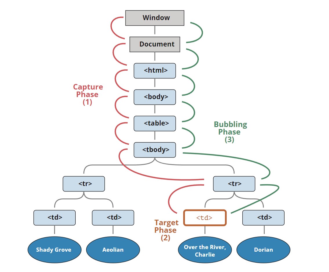
The DOM event standard describes the three phases of event propagation:

  1. Capturing phase — The event travels down the hierarchy of elements (from the window).
  2. Target phase — The event reaches the target element.
  3. Bubbling phase — The event starts to bubble up from the element.

Below is an illustration of clicking on <td> in a table, taken from the specification:

Event-Bubbling

In other words: Clicking on <td>, the event first descends through the ancestor chain to the element (capturing phase), then reaches the target (target phase), and finally ascends (bubbling phase), calling handlers along the way.

So far, we have only discussed bubbling because the capturing phase is rarely used. Typically, we don’t see it.

Handlers added with on<event> attributes or using HTML attributes or with addEventListener(event, handler) with two arguments have no knowledge of capturing; they run only in the second and third phases.

Summary

When an event occurs — the element nested deepest where the event happened is marked as the “target element” (event.target).

  • Then, the event moves down from the document root to the event.target, invoking handlers assigned with addEventListener(..., true) (where true is a shorthand for {capture: true}).
  • Next, the handler on the target element itself is called.
  • Finally, the event bubbles up from event.target to the root, calling handlers assigned with on<event>, HTML attributes, and addEventListener without a third parameter or with false/{capture: false}.

Each handler has access to properties of the event object:

  • event.target — The element deepest in the hierarchy that triggered the event.
  • event.currentTarget (=this) — The current element handling the event (the one with the handler).
  • event.eventPhase — The current phase (capturing=1, target=2, bubbling=3).

Any event handler can stop the event by calling event.stopPropagation(), but it’s not recommended because we might not be sure if we genuinely don’t need the event to bubble up for other purposes.

The capturing phase is rarely used, and usually, events are handled during the bubbling phase. There’s a reason for this logic.

Event handlers work the same way. Code that sets a handler on a specific element gains the most detailed information about that element. A handler specific to a <td> might be perfectly tailored for that <td>, knowing all about it. So, it should get the chance first. Then, its immediate parent also knows context-specific details but fewer, and so on, until handling general concepts and running the last handler on the topmost element.

Preface

Web Components is a collective term for a set of native web APIs that allow developers to create reusable custom elements.

Vue and Web Components are primarily complementary technologies. Whether integrating custom elements into existing Vue applications or building and distributing custom elements using Vue, Vue provides excellent support for both using and creating custom elements.

What are Custom Elements

A key feature of Web Components is the ability to create custom elements: HTML elements whose behavior is defined by web developers, extending the set of elements available in browsers.

There are two types of custom elements in Web Components:

  • Customized Built-in Elements: Inherit from standard HTML elements, such as HTMLImageElement or HTMLParagraphElement. Their implementation defines the behavior of standard elements.
  • Autonomous Custom Elements: Inherit from the HTML element base class HTMLElement. You have to implement their behavior from scratch.

Custom Element Lifecycle Callbacks

Custom Elements also have lifecycle callbacks.

Once your custom element is registered, the browser calls certain methods of your class when your custom element interacts with the page in specific ways. By providing implementations for these methods, known as lifecycle callbacks, you can run code to respond to these events.

The custom element lifecycle callbacks include:

  • connectedCallback(): Called whenever the element is added to the document. The specification recommends developers to set up custom element properties in this callback rather than in the constructor.
  • disconnectedCallback(): Called whenever the element is removed from the document.
  • adoptedCallback(): Called whenever the element is moved to a new document.
  • attributeChangedCallback(): Called when attributes are changed, added, removed, or replaced. For more detailed information about this callback, see Responding to attribute changes.

Here is a minimal example of a custom element that logs these lifecycle events:

// Create a class for this element
class MyCustomElement extends HTMLElement {
  static observedAttributes = ["color", "size"];

  constructor() {
    // Must call the super method first
    super();
  }

  connectedCallback() {
    console.log("Custom element added to the page.");
  }

  disconnectedCallback() {
    console.log("Custom element removed from the page.");
  }

  adoptedCallback() {
    console.log("Custom element moved to a new page.");
  }

  attributeChangedCallback(name, oldValue, newValue) {
    console.log(`Attribute ${name} has changed.`);
  }
}

customElements.define("my-custom-element", MyCustomElement);

Using Custom Elements in Vue

Using custom elements in a Vue application is largely similar to using native HTML elements, but a few points need to be kept in mind:

Skipping Component Resolution

By default, Vue tries to parse non-native HTML tags as registered Vue components and then render them as custom elements. This leads to Vue issuing a “Unknown custom element” warning during development. To inform Vue that certain elements should be treated as custom elements and skip component resolution, we can specify the compilerOptions.isCustomElement option.

If you are using Vue for build setup, this option should be passed through build configuration as it is a compile-time option.

Example of in-browser configuration:

// Only works if using in-browser compilation.
// If using build tools, see config examples below.
app.config.compilerOptions.isCustomElement = (tag) => tag.includes('-')

Vite Configuration Example

// vite.config.js
import vue from '@vitejs/plugin-vue'

export default {
  plugins: [
    vue({
      template: {
        compilerOptions: {
          // treat all tags with a dash as custom elements
          isCustomElement: (tag) => tag.includes('-')
        }
      }
    })
  ]
}

Vue CLI Configuration Example

// vue.config.js
module.exports = {
  chainWebpack: config => {
    config.module
      .rule('vue')
      .use('vue-loader')
      .tap(options => ({
        ...options, 

        
        compilerOptions: {
          // treat any tag that starts with ion- as custom elements
          isCustomElement: tag => tag.startsWith('ion-')
        }
      }))
  }
}

Building Custom Elements with Vue

The primary advantage of custom elements is their ability to be used with any framework or even without a framework. This makes them suitable for distributing components to end consumers who may not use the same frontend stack, or when you want to isolate the implementation details of the components used in the final application.

Defining Custom Elements

Vue supports creating custom elements using the same Vue component API with the defineCustomElement method. This method takes the same parameters as defineComponent but returns an extended custom element constructor HTMLElement:

Template:0

<my-vue-element></my-vue-element>
import { defineCustomElement } from 'vue'

const MyVueElement = defineCustomElement({
  // normal Vue component options here
  props: {},
  emits: {},
  template: `...`,

  // defineCustomElement only: CSS to be injected into shadow root
  styles: [`/* inlined css */`]
})

// Register the custom element.
// After registration, all `<my-vue-element>` tags
// on the page will be upgraded.
customElements.define('my-vue-element', MyVueElement)

// You can also programmatically instantiate the element:
// (can only be done after registration)
document.body.appendChild(
  new MyVueElement({
    // initial props (optional)
  })
)

When discussing custom elements and Vue components, we are essentially talking about two different approaches to building web applications. Custom elements are a web standard, akin to HTML elements, while Vue components are a more advanced building approach provided by the Vue.js framework.

Some argue that using only custom elements is a more “future-proof” approach, but this passage points out that such a view is overly simplistic. It lists reasons explaining why the Vue component model is more practical. Some key points include:

Vue components offer more features, such as a convenient template system, methods for managing state, and an efficient way to render components on the server. These features are essential for building complex applications.

Vue components support powerful composition mechanisms, while custom elements have some limitations in this regard. This means that with Vue, you can build flexible and powerful component structures more easily. Using Vue, you leverage a mature framework and a large community, without having to build and maintain an internal framework.

There is indeed some overlap in functionality between custom elements and Vue components: both allow us to define reusable components with data passing, event emitting, and lifecycle management. However, the Web Components API is relatively lower-level and simpler. To build actual applications, we need some additional features not covered by the platform:

  • Declarative and efficient template system;
  • A reactive state management system conducive to extracting and reusing logic across components;
  • A high-performance method for rendering components on the server (SSR) and composing them on the client side, crucial for Web Vitals metrics like SEO and LCP. Native custom elements SSR typically involves simulating the DOM in Node.js and then serializing the mutated DOM, while Vue SSR compiles as much as possible into string concatenation, which is more efficient.

defineCustomElement API Vue Component Transformation

Using the defineCustomElement API to transform Vue components into registerable custom element classes has several benefits:

  1. Cross-Framework Integration: By transforming Vue components into custom element classes, you can use these components in different frontend frameworks and libraries. This makes your components more versatile and integrable with other technology stacks.

  2. Independent Usage: After registering a Vue component as a custom element, it can be used independently of a Vue application. This means you can use the component without an entire Vue application, and introduce it into different build systems and module systems.

  3. Progressive Migration: If your application is gradually transitioning to Vue, you can achieve a progressive migration by transforming certain components into custom elements. This allows you to gradually introduce Vue components into an existing project without the need for a complete rewrite.

  4. Web Components Standard Compatibility: Registering Vue components as custom elements makes them compatible with the Web Components standard. This means you can leverage other tools and libraries in the Web Components ecosystem, enhancing the interoperability of your components.

In other words, the defineCustomElement API’s purpose is to compile Vue components into custom elements that can be used in the browser without relying on the Vue compiler for real-time compilation.

When using the defineCustomElement API, Vue components are pre-compiled into native custom elements, allowing them to be used directly in the browser without runtime compilation.

Overall, by using the defineCustomElement API, you can combine Vue components with custom elements, making these components usable and shareable in a broader context. This provides increased reusability and flexibility for components, especially in the context of cross-platform component development, where you can develop components as custom elements and use them in different environments. A typical example is the integration implementation mentioned earlier between Vue 2 and Vue 3, meaning you only need to compile Vue 3 components into custom elements and then use them in Vue 2.

Introduction

After December 31, 2023, the functionality of Vue 2 will still be available, but no further updates will be provided, including security updates and browser compatibility.

Evan announced that the first RC of Vue 3 will be released in mid-July. This article suggests that library/plugin authors start migrating their support to Vue 3. However, due to significant changes in API and behavior, is it possible to make our libraries support both Vue 2 and 3 simultaneously?

Universal Code

The simplest approach is to write universal code that works for both versions, without any additional modifications, similar to what people have done with Python 2 and 3. However, simplicity does not mean it’s easy. Writing such components requires avoiding newly introduced features in Vue 3 and deprecated features in Vue 2. In other words, you cannot use:

  • Composition API
  • .sync and .native modifiers
  • Filters
  • 3rd-party vendor objects

Using Branches

The response from core team members suggests using different branches to separate support for each targeted version. This is a good solution for existing and mature libraries, as their codebases are usually more stable, and version targeting optimizations may require better code isolation.

The downside of this approach is that you need to maintain two codebases, which doubles your workload. It is not ideal for small libraries or new libraries that want to support both versions and avoid duplicating bug fixes or feature additions. I do not recommend using this approach from the beginning of a project.

Build Scripts

In VueUse, I wrote some build scripts to import code from the target version’s API during the build. After that, I need to publish two tags, vue2 and vue3, to differentiate the support for different versions. With this, I can write the code once and make the library support both Vue versions. The issue is that I need to build twice on each version and guide users to install the corresponding plugin versions (manually install @vue/composition-api for Vue 2).

Approach for Coexistence Development of Vue 2/3

Simultaneous Support for Vue 2/3 Projects

Possible Scenarios for Vue 2/3 Projects

Progressive Migration: If there is a large Vue 2 project but you want to gradually migrate to Vue 3, you can choose to introduce Vue 3 into the project and then gradually migrate Vue 2 components to Vue 3.

Compatibility with Dependency Libraries and Plugins: If the project depends on some Vue 2 plugins or libraries that have not been upgraded to Vue 3 yet, it may be necessary to use both Vue 2 and Vue 3 to ensure compatibility.

Adopting Vue 3 for New Features: You may want to use Vue 3 in the project to take advantage of its new features and performance benefits while still keeping Vue 2 for old components or features.

Project Integration: Based on experience requirements within the company, there is a need to present Vue 2/3 projects on the same page.

Internal Component Asset Maintainer: Support is needed for both Vue 2 and 3 projects, and the capabilities must be consistent.

Legacy Application Developer: Need to use a third-party chart component, but only the Vue 3 version is available, not the Vue 2 version.

Solutions

1. Coexistence of Vue 2/3 Projects

vue-5

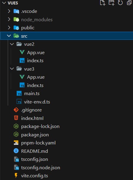
Directly create a Vue 3 root instance using createApp and mount it to the Vue 2 root instance using the mount method. This allows using Vue 3 components in a Vue 2 project.

The related code repository can be found here: vue5

vue-5

// Vue 3 项⽬
import { createApp } from 'vue'
import App from './App.vue'

createApp(App).mount('#vue3')
// Vue 2 项⽬
import Vue from 'vue2'
import App from './App.vue'

new Vue({
  render: h => h(App as any),
}).$mount('#vue2')

The important thing about this approach is that we use the vite.config.ts to solve the compilation problem of different modules: I wrote some build scripts to import code from the target version’s API during the build. After that, I need to publish two tags vue2 and vue3 to differentiate the support for different versions. But the issue is that it requires guiding users to install the corresponding plugin versions on each version. This is not very friendly for developers to deal with package conflicts.

import path from 'path'
import { defineConfig } from 'vite'
import Vue2 from '@vitejs/plugin-vue2'
import Vue3 from '@vitejs/plugin-vue'
import Inspect from 'vite-plugin-inspect'
import compiler from 'vue2/compiler-sfc'

const src = path.resolve(__dirname, 'src')

export default defineConfig({
  plugins: [
    Vue3({
      include: [/vue3[/\\].*\.vue$/],
    }),
    Vue2({
      include: [/vue2[/\\].*\.vue$/],
      compiler: compiler as any,
    }),
    Inspect(),
  ],
})

Here we have separated Vue 2 and Vue 3 into two independent packages and configured different compilation rules in vite.config.ts, allowing us to use Vue 2 and Vue 3 in the same page.

2. JessicaSachs/petite Solution

Let’s briefly introduce petite:

Petite is a subjective GitHub template built for Vue component authors. It sets up the tools needed for developing, documenting, and testing common SFC components and is backward compatible with Vue 2.7 runtime.

This is achieved through some runtime helper functions and a very opinionated monolithic library structure.

Petite sets up Vite, Volar, Linting, Vitepress, TypeScript, and Testing, allowing you to choose to write Vue 3-style code while easily maintaining backward compatibility with Vue 2.x users.

This also means that you will be publishing two versions of your package on npm instead of breaking major versions to support Vue 2 or Vue 3.

The downside of this approach is that your users will need to install the new version when upgrading and changing imports. The benefit is that you can write backward-compatible code more easily and provide regular updates for users. Additionally, you can also separate dependencies for Vue 2-only and Vue 3-only.

If you use lodash in your shared code, you will need to run pnpm build in the workspace root directory, and each package (lib-vue3, lib-vue2) should be deployed independently.

3. vue-bridge Solution

4. vue-demi Solution

Repository example: vue-demi

Vue Demi is a development utility that allows you to write universal Vue libraries for both Vue 2 and 3 without worrying about the version installed by the user.

When creating a Vue plugin/library, simply install vue-demi as a dependency and import any Vue-related content from it. Publish your plugin/library as usual, and your package will become universal!

{
  "dependencies": {
    "vue-demi": "latest"
  }
}
import Vue, { reactive, ref } from 'vue-demi'

At the underlying level, it uses the postinstall npm hook. After installing all the packages, the script will start checking the installed Vue version and redirect the exports based on the local Vue version. When using Vue 2, it will also automatically install @vue/composition-api if it is not already installed.

Points to note about libraries/components:

Libraries/Components

  • Single repository - Multiple package builds
  • Dependency management
  • Alias configuration
    • NPM package names
    • Build tool configuration

Importing Vue 3 Components in a Vue 2 Application

There are limitations to component interoperability

  • Shared context
  • Scoped slots
  • Events

Approach for importing Vue 3 components in a Vue 2 application

  • Vue 3 can have multiple global instances
  • Prerequisite: Upgrade Vue 2 to 2.7, remove outdated plugins from Vue CLI
  • Interoperability layer: Custom Elements
  • Build tool: Vite

“All human suffering is essentially anger at one’s own powerlessness.”

“When you don’t love me, I may still love you, and at the same time love the past self.
He is cute, stubborn, and irreplaceable. Actually, thank you for your consideration. These days, the sky is blue and clear.”

  • “Spending Long Years with Anthony”

Introduction

Since attending a frontend conference last week, I have gained some new insights into new technologies in frontend development. One of them is about Chrome local code debugging. So, I want to make a simple record here. First, let me share a link: youtube-ChromeDevs

I would like to express my gratitude to the Chrome DevTools team for their excellent work. However, before the frontend conference by jecfish, I was not aware of so many friendly web debugging tools and performance testing methods. So, I will make a simple record here. If you are interested, you can check out the link above, which contains a lot of useful information. Feel free to show your support to their team.

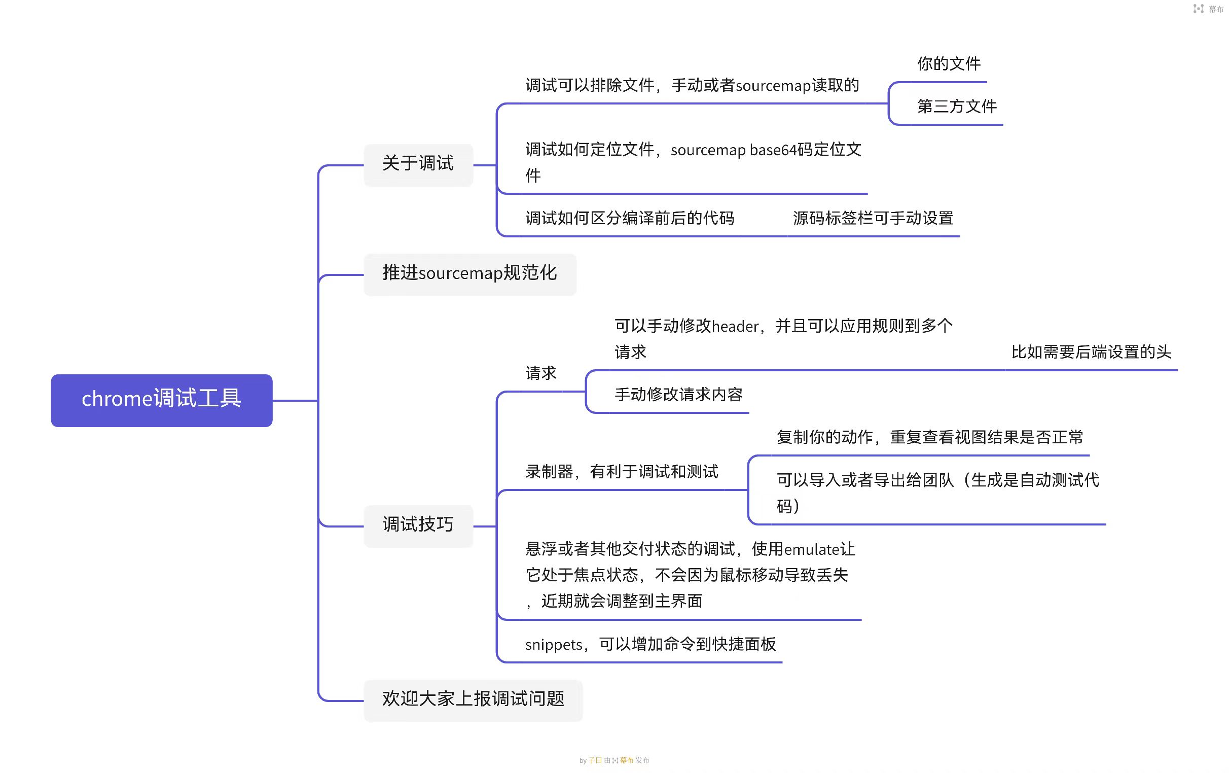
Below is the outline of this chapter, which will be further elaborated.

ModernWeb

Local Code Debugging

This section will cover local code debugging, mainly focusing on the topic of source maps. I will provide some brief introductions and examples.

The Need for Source Code Mapping

Here is a link: source-map

This link contains some content about source maps written by jecfish. If you are interested, you can check it out. If the article is too long for you, you can directly read the content below.

Today, we are going to discuss source code mapping, an important tool in modern web development that greatly simplifies debugging work. In this article, we will explore the basics of source code mapping, how source code mapping is generated, and how it improves the debugging experience.

Before diving into the study of source maps, we need to have a basic understanding of Modern Web. So, what should we talk about when I mention Modern Web?

ModernWeb

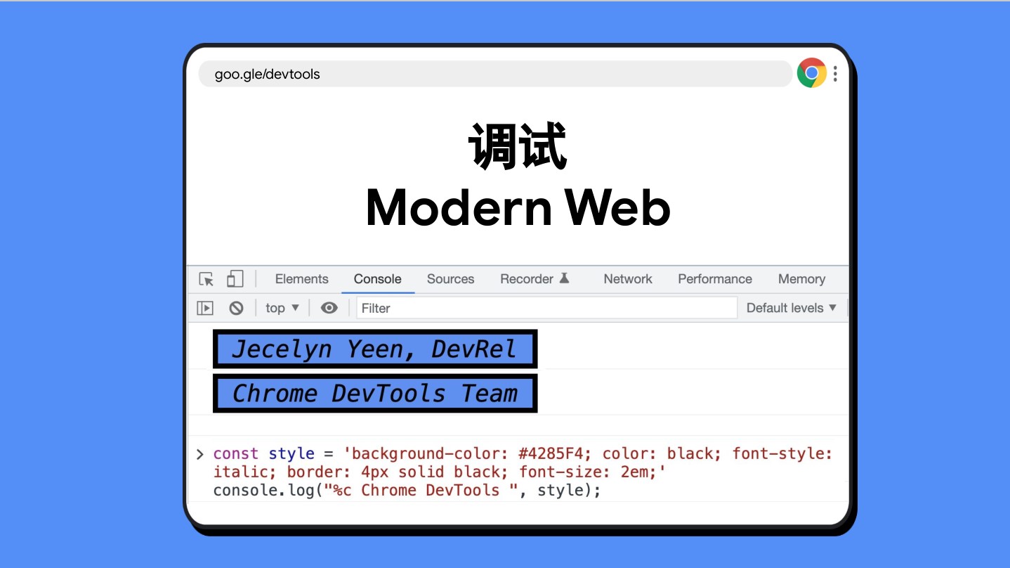
We can see that the console prints some content related to BaseOn CSS styles. Although we are not going to focus on the CSS styles of the console today, you can still define some styles to make your console output more beautiful!

ModernWeb

ModernWeb

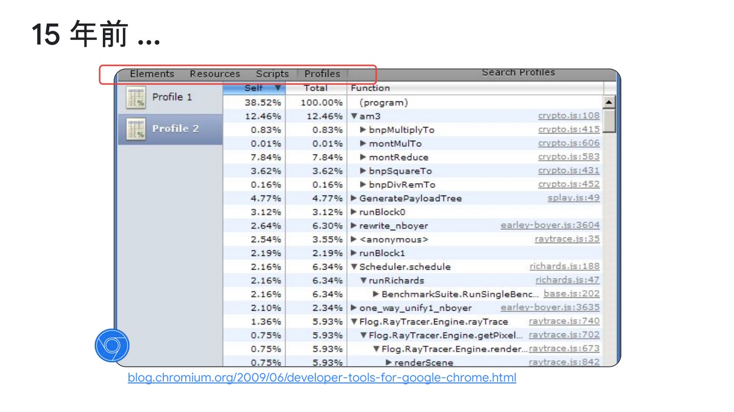
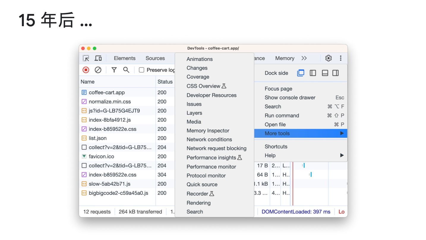
After 15 years, we can see that the debugging tools in the Chrome DevTools have evolved from a few options to a rich and diverse set of tools. The changes have been significant. So, today, let’s talk about the specific applications of these 32 debugging tools in Chrome.

ModernWeb

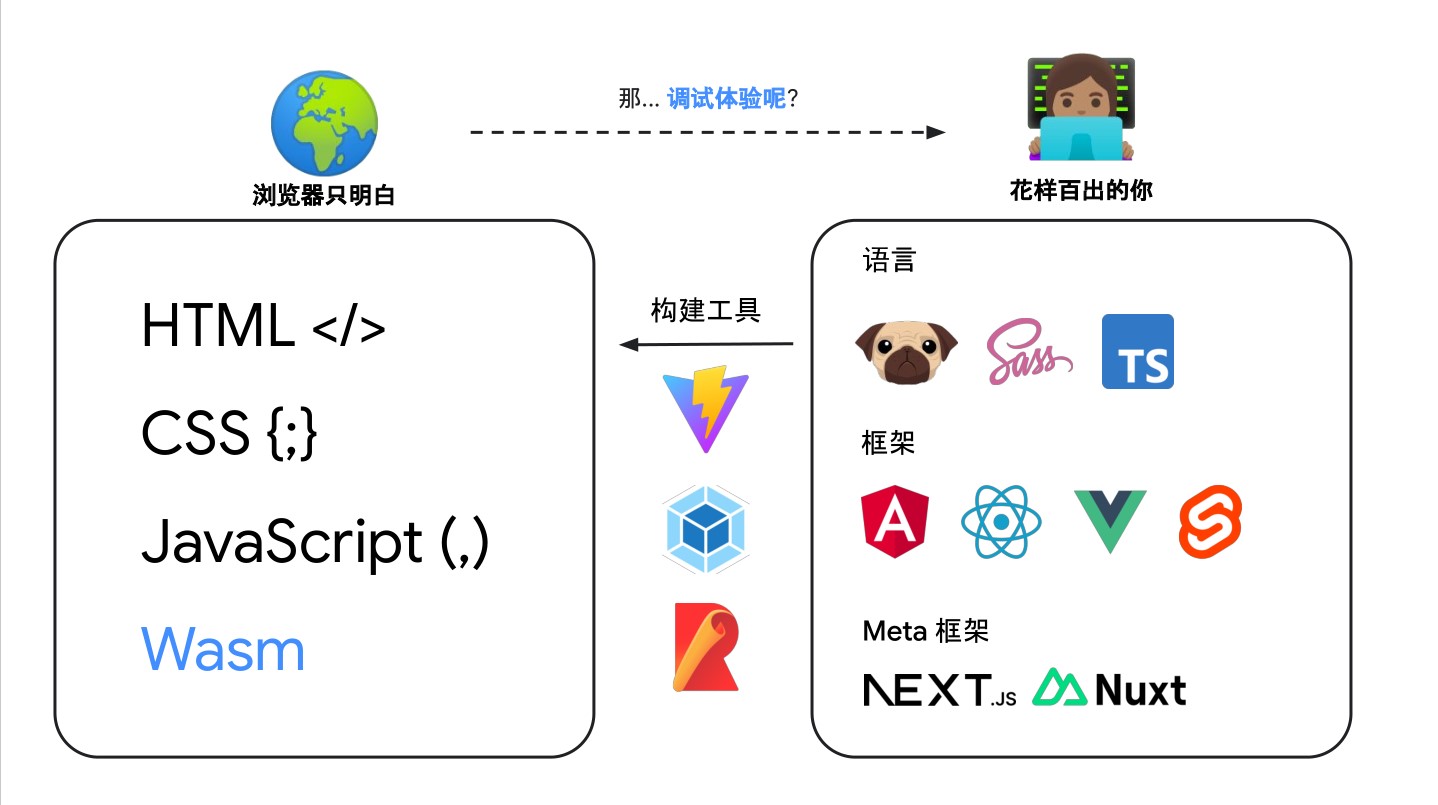
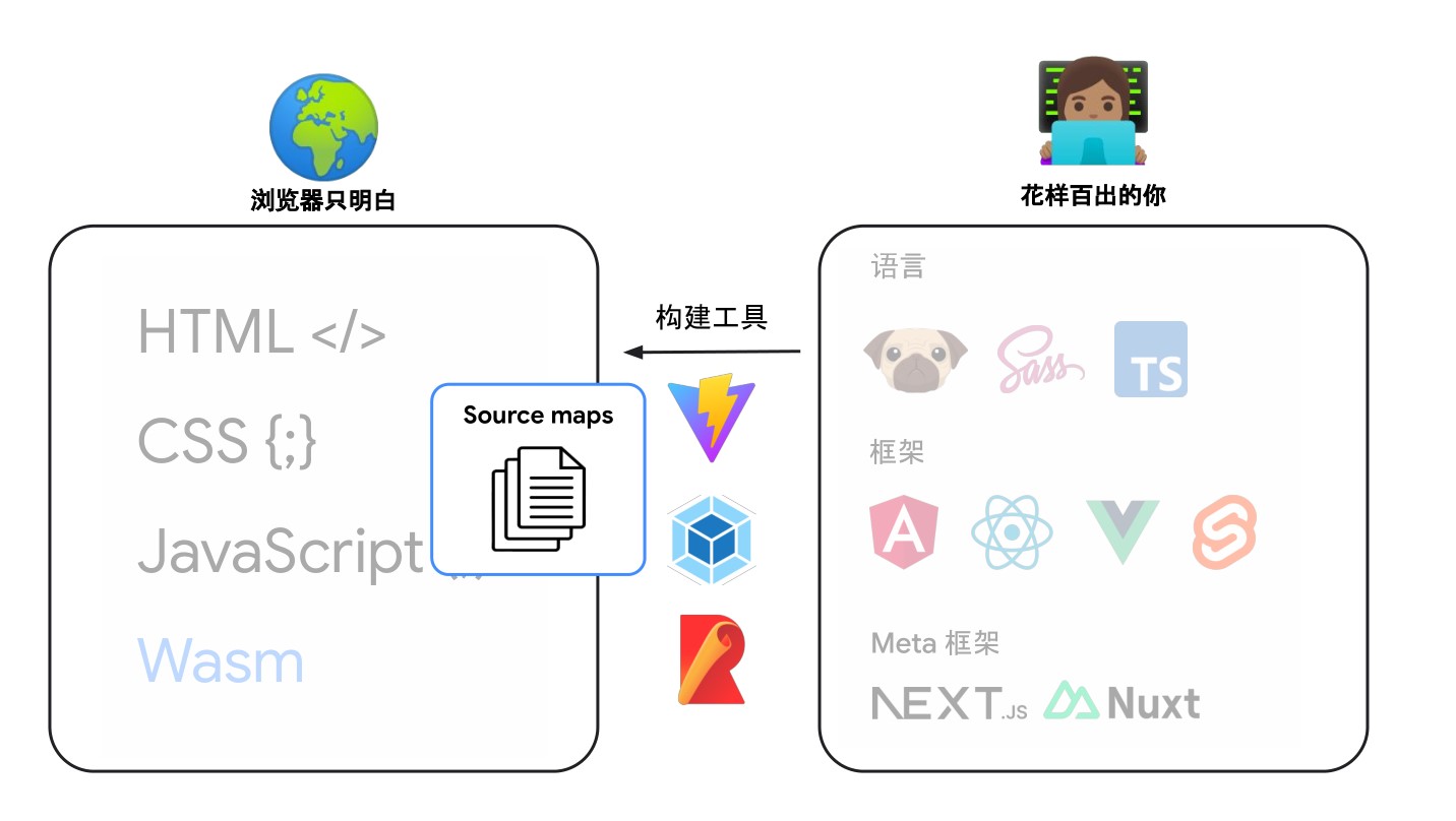
We know that browsers only understand a few languages: HTML </> CSS {;} JavaScript (,) Wasm (of course, modern browser engines now have built-in support for Wasm modules by default). However, our frontend frameworks are extremely rich, involving languages such as TypeScript, Less, Sass, and frameworks such as Vue, React, and meta frameworks such as Nust.js, Next.js. These frameworks are used in our frontend code, but browsers do not understand these languages. Therefore, we need to convert these languages into languages that browsers can understand.

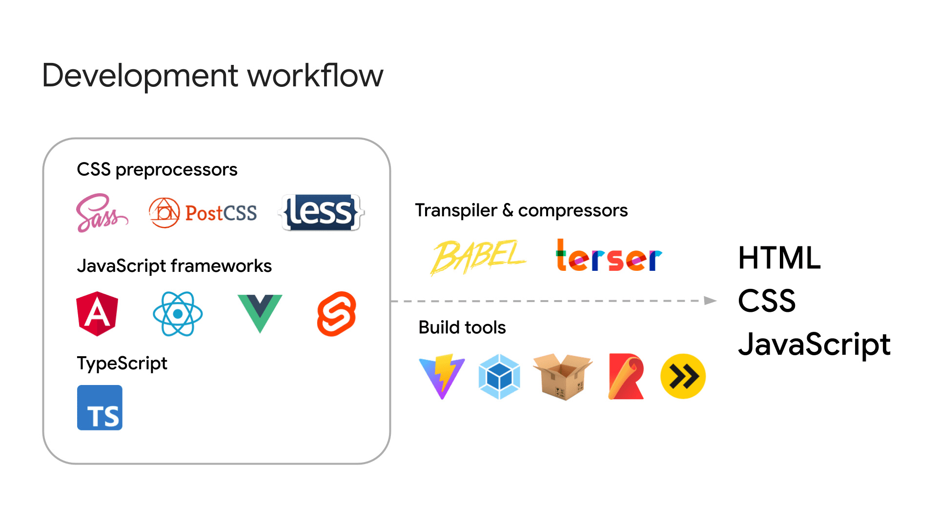
We are building more complex web applications, and your development workflow may involve the use of various tools. For example:

  • Template languages and HTML preprocessors: Pug, Nunjucks, Markdown.
  • CSS preprocessors: SCSS, LESS, PostCSS.
  • JavaScript frameworks: Angular, React, Vue, Svelte.
  • JavaScript meta frameworks: Next.js, Nuxt, Astro.
  • Advanced programming languages: TypeScript, Dart, CoffeeScript.
    And more. The list keeps growing!

ModernWeb

These tools require a build process to transpile the code into standard HTML, JavaScript, and CSS that browsers can understand. Additionally, for performance optimization, it is common practice to minify (e.g., using Terser to reduce and obfuscate JavaScript) and concatenate these files to reduce their size and improve web efficiency.

During the process of converting these various template languages, preprocessors, and meta frameworks into HTML, JavaScript, and CSS that browsers can understand, there is a compilation process that generates some intermediate code. This intermediate code is our source code mapping, which is what we are going to talk about today.

For example, using a build tool, we can transpile and minify the following TypeScript file into a single line of JavaScript. You can find this demo on GitHub: parcel-demo

/* A TypeScript demo: example.ts */

document.querySelector('button')?.addEventListener('click', () => {
  const num: number = Math.floor(Math.random() * 101);
  const greet: string = 'Hello';
  (document.querySelector('p') as HTMLParagraphElement).innerText = `${greet}, you are no. ${num}!`;
  console.log(num);
});

Certainly! Below is the English translation of the provided content:

/* A compressed JavaScript version of the TypeScript demo: example.min.js */

document.querySelector("button")?.addEventListener("click", (() => {
    const e = Math.floor(101 * Math.random());
    document.querySelector("p").innerText = `Hello, you are no. ${e}!`;
    console.log(e);
}));

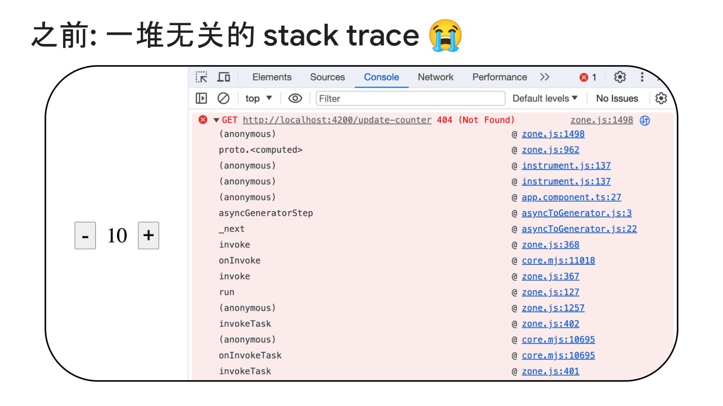
However, this optimization increases the difficulty of debugging. If compressed code puts everything in a single line and uses short variable names, it becomes challenging to trace the root of the problem. This is where source maps come into play—they map the compiled code back to the original code.

ModernWeb

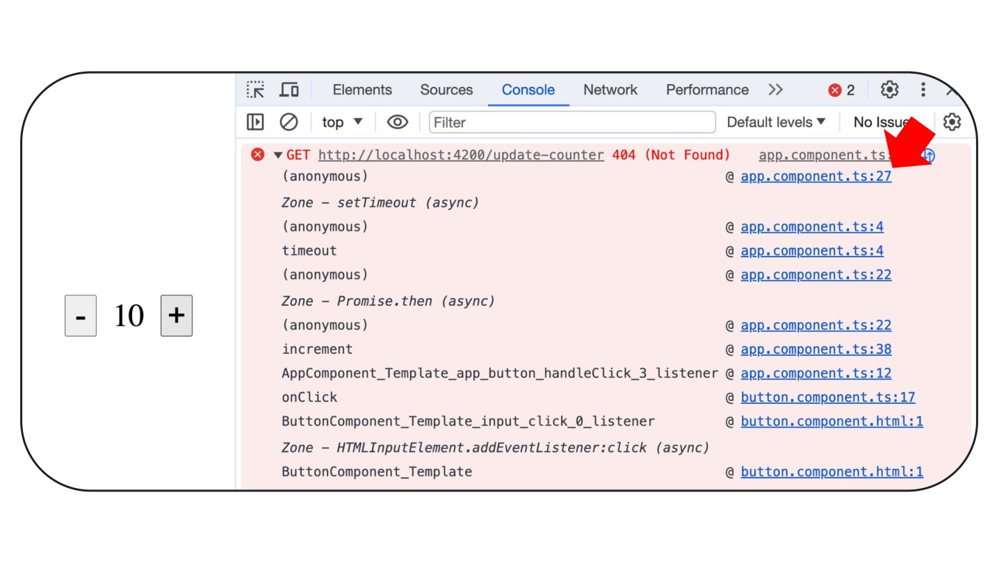
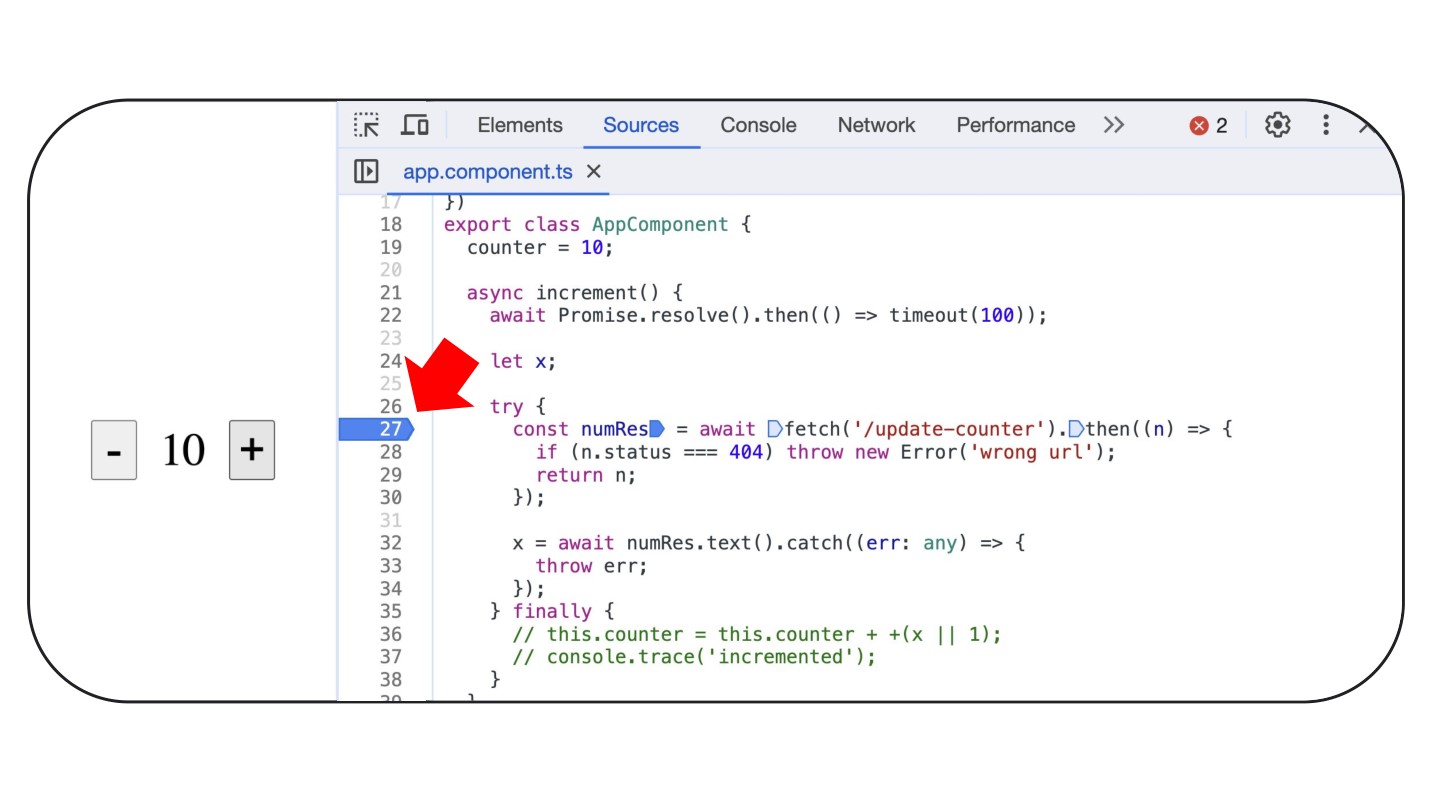
Now let’s look at a specific example. This example is a simple click event triggering an XHR written in TypeScript, where a 404 error is reported.

ModernWeb

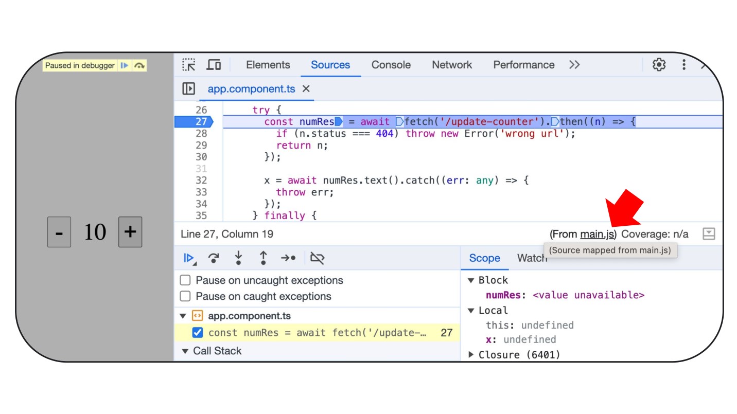
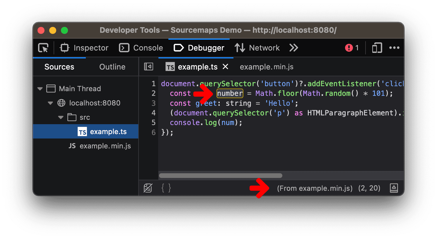
Oh? What’s happening here? Pay attention to the red arrow; it seems like our browser understands TypeScript code?

ModernWeb

ModernWeb

Actually, it’s not the case. Looking at this image, it appears that TypeScript is parsed from main.js.

Understanding Source Code Mapping (source-map)

ModernWeb

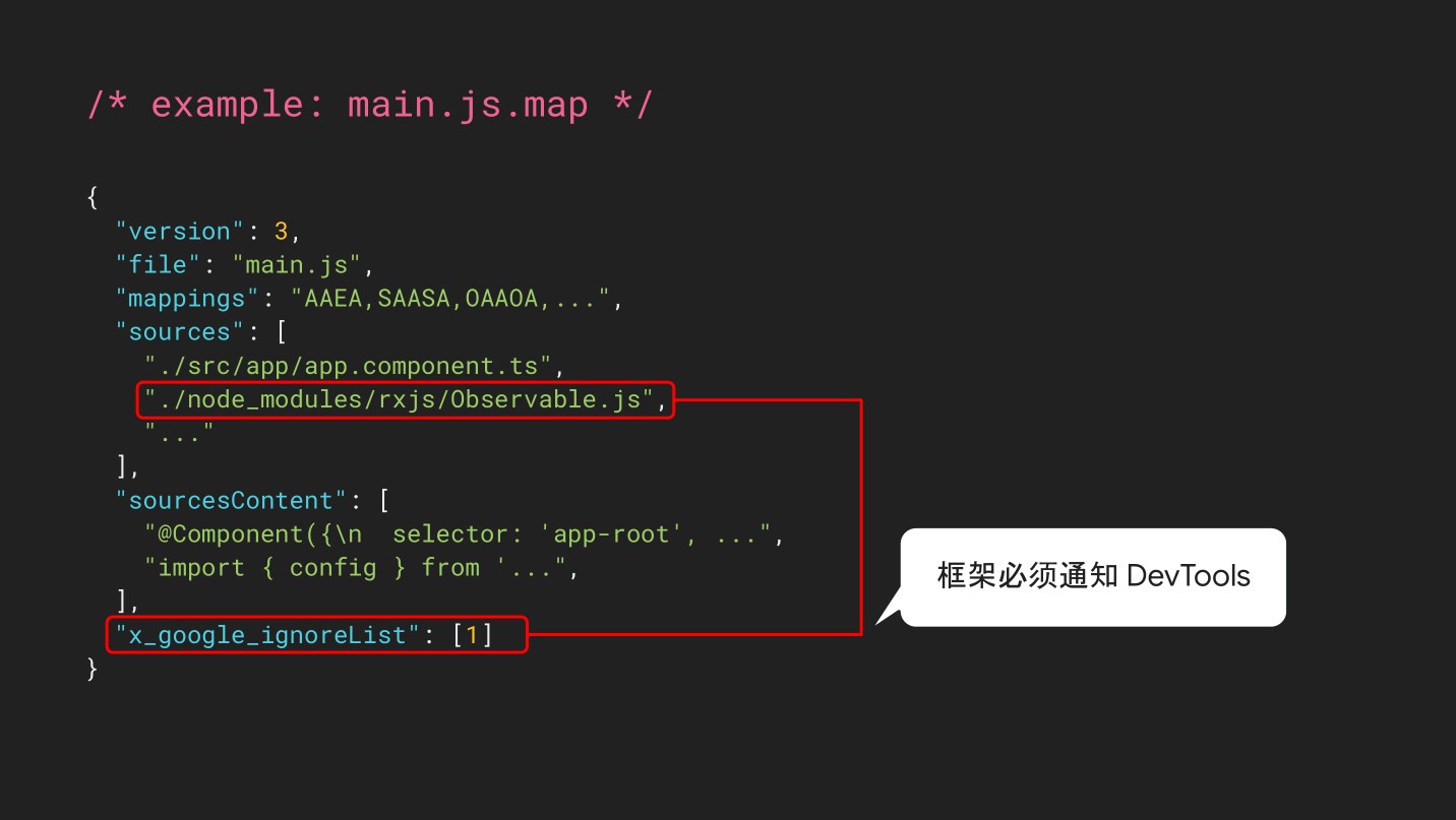
These source map files contain basic information about how the compiled code maps back to the original code, allowing developers to easily debug. Here’s an example of a source map:

{
  "mappings": "AAAAA,SAASC,cAAc,WAAWC, ...",
  "sources": ["src/script.ts"],
  "sourcesContent": ["document.querySelector('button')..."],
  "names": ["document","querySelector", ...],
  "version": 3,
  "file": "example.min.js.map"
}

To understand each field, you can read the Source Map Specification or this classic article on Anatomy of a Source Map.

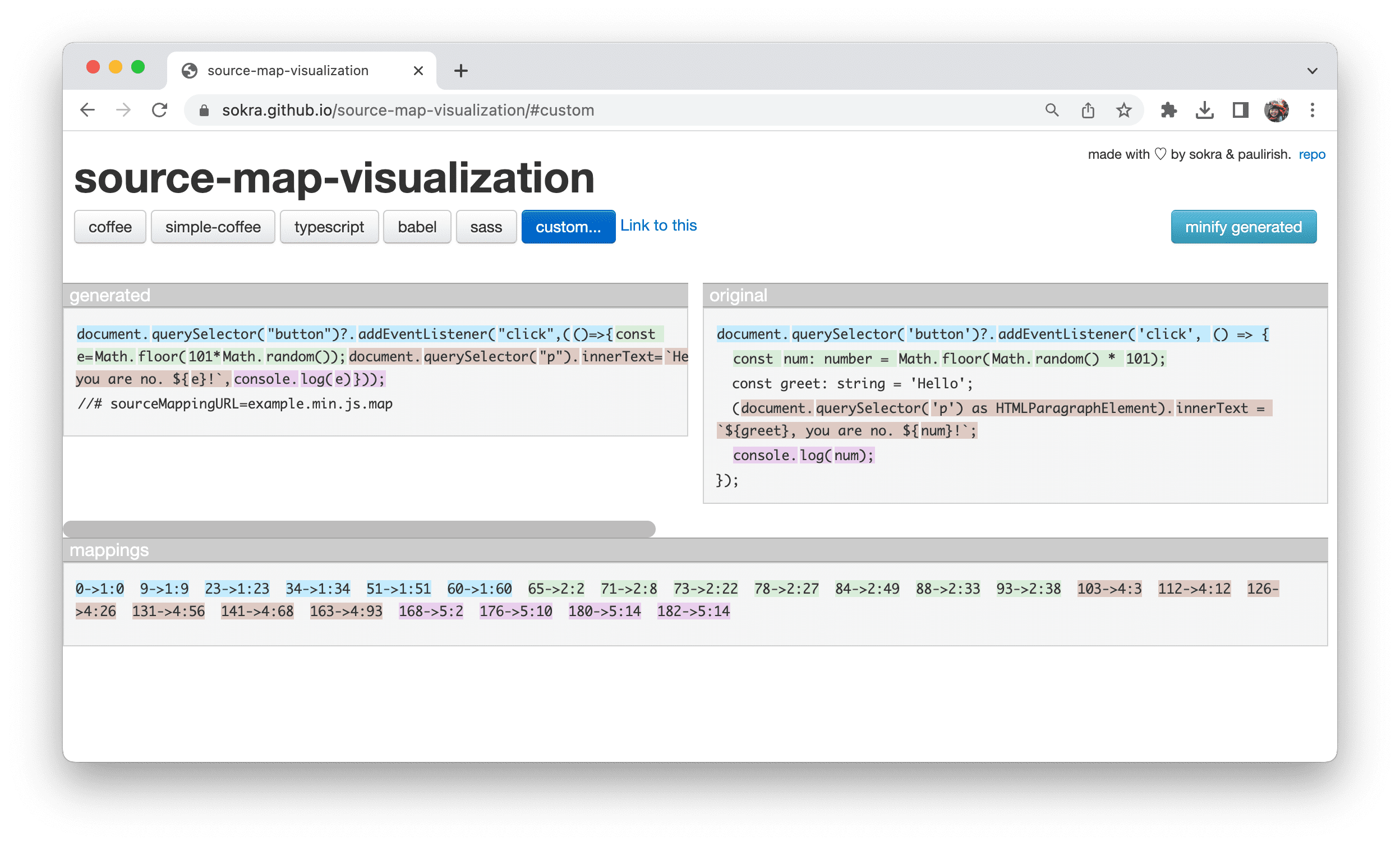
The most crucial aspect of source maps is the mappings field. It uses VLQ base 64-encoded strings to map lines and positions in the compiled file to the corresponding original file. Source map visualization tools like source-map-visualization and Source Map Visualization can intuitively display this mapping.

ModernWeb

The left column represents the generated code, while the original column shows the original source.

Visualization tools color code each line in the original column and the corresponding code in the generated column.

The mapping section shows the decoded code mappings. For example, the entry 65 -> 2:2 means:

  • Generated code: The word const in the compressed content starts at position 65.
  • Original code: The word const starts at line 2, column 2 in the original content.

This way, developers can quickly identify the relationship between the minified code and the original code, making the debugging process smoother.

Browser developer tools apply these source code mappings, helping you pinpoint debugging issues directly in the browser.

ModernWeb

ModernWeb

ModernWeb

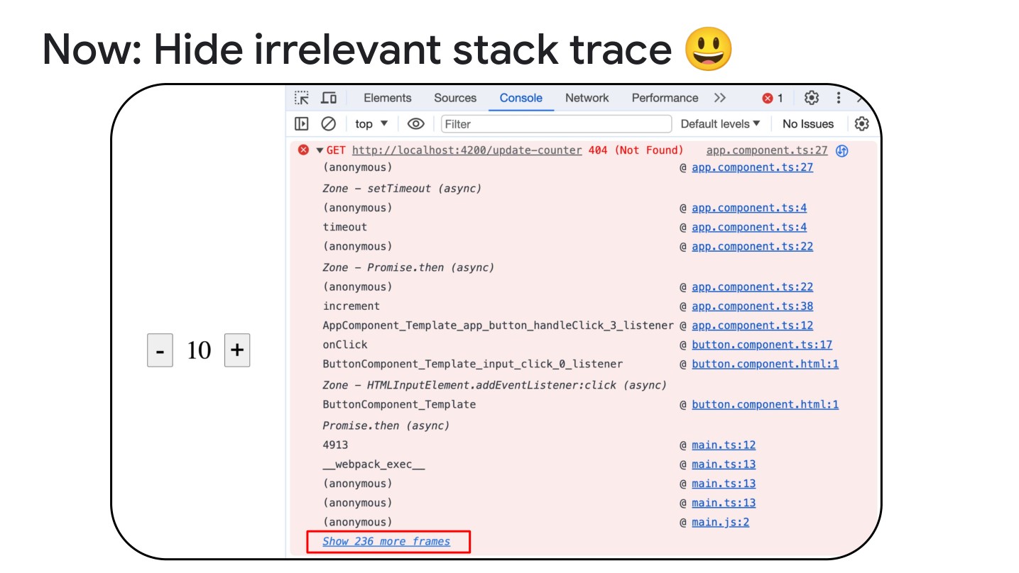
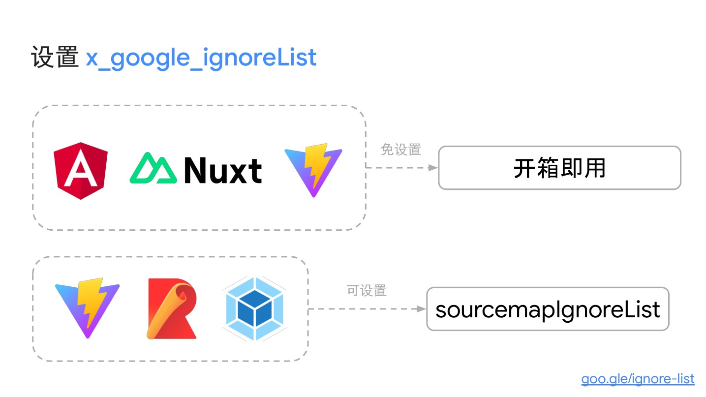
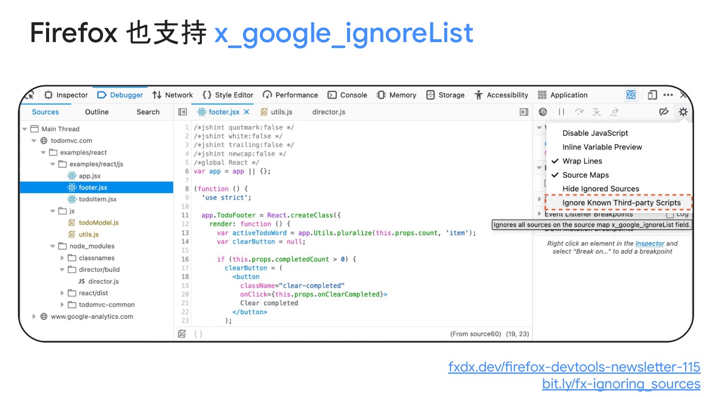
How DevTools Know What to Hide? Source Maps

ModernWeb

ModernWeb

ModernWeb

Practical Chrome Debugging Tips

Requests

ModernWeb

You can view detailed information about requests in the Network panel, including request headers, response headers, request body, response body, Cookies, Timing, and more.

Additionally, DevTools overrides allow you to simulate remote resources by overriding HTTP response headers and web content (including XHR and fetch requests) through local overrides. This enables you to prototype changes without waiting for backend support. Local overrides also let you retain changes made in DevTools during page load.

This is particularly useful in situations where frontend requests to the backend return results that haven’t undergone cross-origin handling (cross-origin handling is typically done on the backend). In such cases, even though the frontend receives correct data, the browser may mark the file as untrusted due to security policies. Local overrides allow you to simulate the backend’s response, facilitating frontend debugging.

Or, if some data on the backend hasn’t been modified yet, and the frontend receives outdated data, do we have to wait for backend engineers to fix the data before we can work on it? That seems a bit inefficient. Instead, we can use content rewriting through local overrides to simulate the modified data, allowing frontend debugging.

ModernWeb

DevTools/overrides indeed is powerful. How does it work?

  • When you make changes in DevTools, DevTools saves a copy of the modified file to a folder you specify.
  • When you reload the page, DevTools provides the locally modified file instead of the network resource.

Overriding Web Content

Set Up a Folder
  • Set up local overrides.
  • Make changes to files and save them in DevTools.

For example, you can edit files in “Sources” or edit CSS in “Elements” > “Styles” unless the CSS is in an HTML file.

DevTools saves the modified files, listing them in Sources > Overrides, and displays them in related panels and panes, indicated by icons next to overridden files in Elements > Styles, Network, and Sources > Overrides.

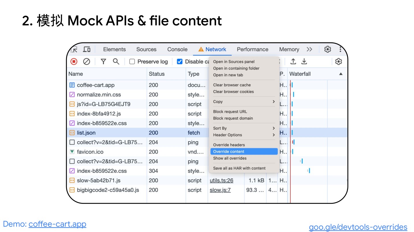
Override XHR or Fetch Requests to Simulate Remote Resources

With local overrides, you don’t need access to the backend, and you don’t have to wait for it to support your changes. Simulate and experiment instantly:

  • Set up local overrides.
  • In Network, filter XHR/fetch requests, find the desired request, right-click it, and choose “Override content.”
  • Make changes to the fetched data and save the file.
  • Refresh. Reload the page and observe the applied changes.

To understand this workflow better, watch the video here.

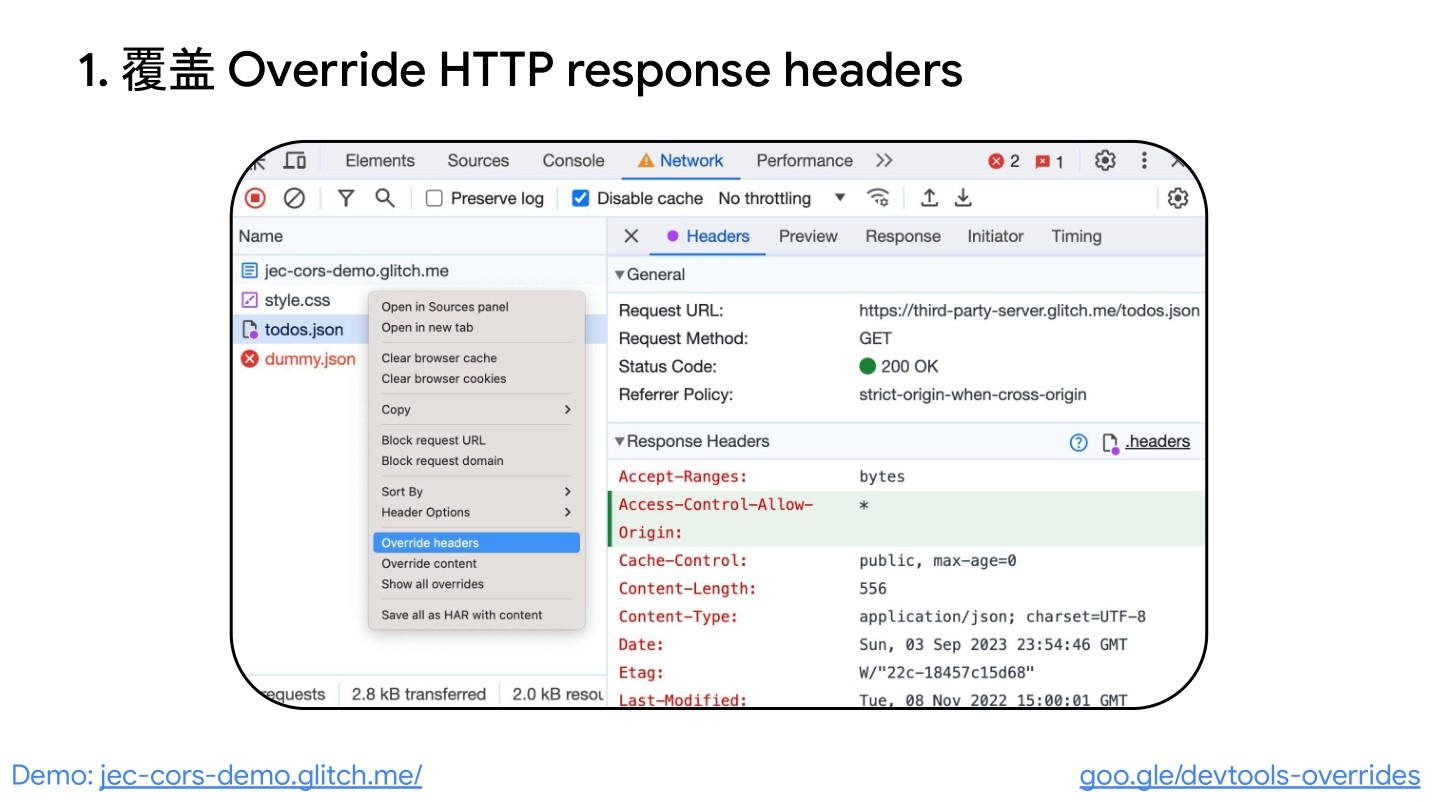
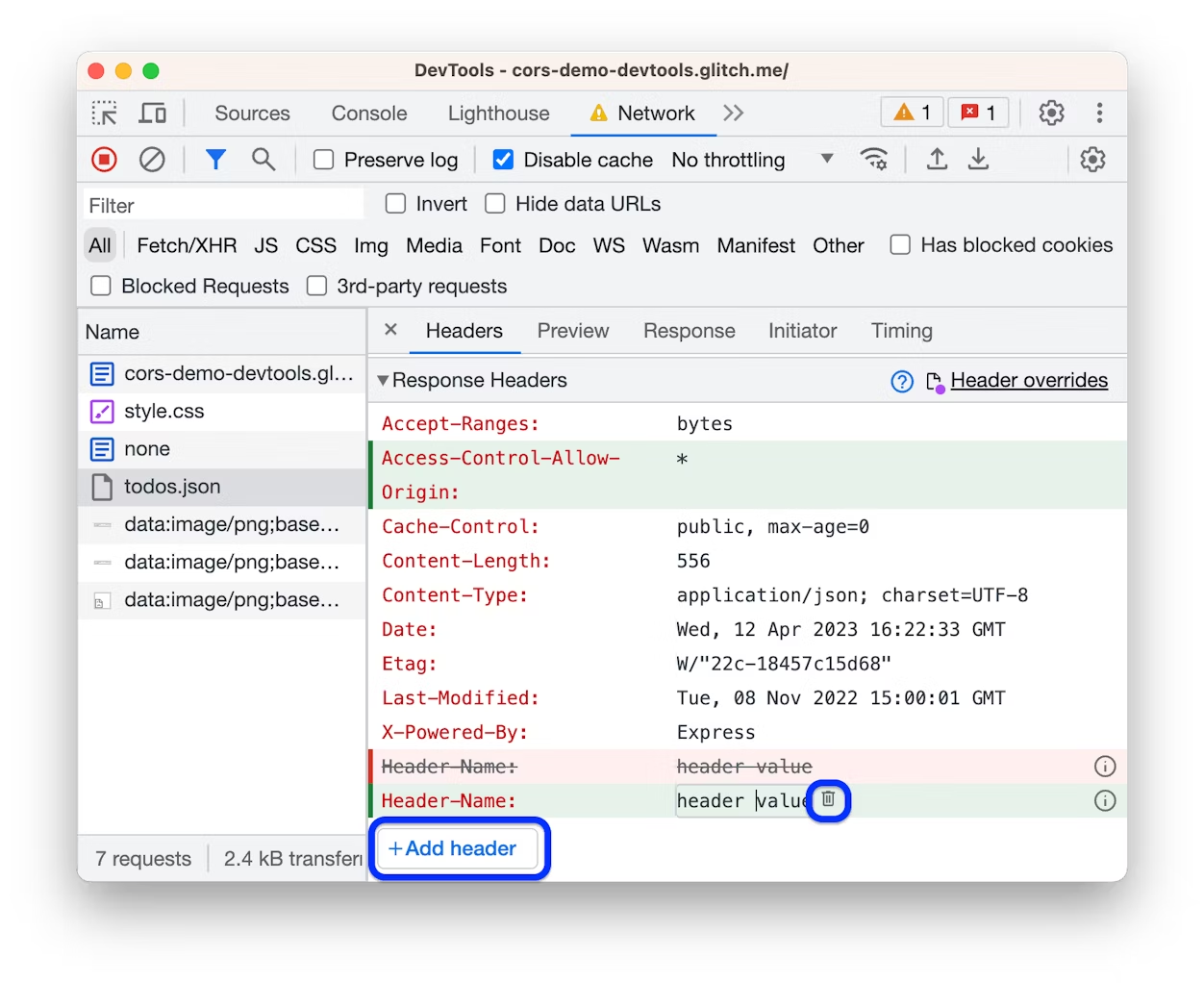
Override HTTP Response Headers

In the “Network” panel, you can override HTTP response headers without accessing the web server.

With response header overrides, you can prototype fixes for various headers, including but not limited to:

  • Cross-Origin Resource Sharing (CORS) headers
  • Permissions-Policy headers
  • Cross-Origin Isolation headers

To override response headers:

  • Set up local overrides and check.
  • Go to Network, find the request, right-click it, and choose “Override headers.” DevTools will guide you to the **Headers

Response Headers Editor**.

ModernWeb

Recorder, Beneficial for Debugging and Testing

Customize and automate user flows based on the Chrome DevTools Recorder for enhanced debugging and testing.

ModernWeb

Writing automated tests might not be the most exciting part of a developer’s life. As developers, our focus is on functionality, fixing bugs, and improving the world! However, having automated tests in our workflow is crucial in the long run. So, we also recognize the importance of writing automated tests.

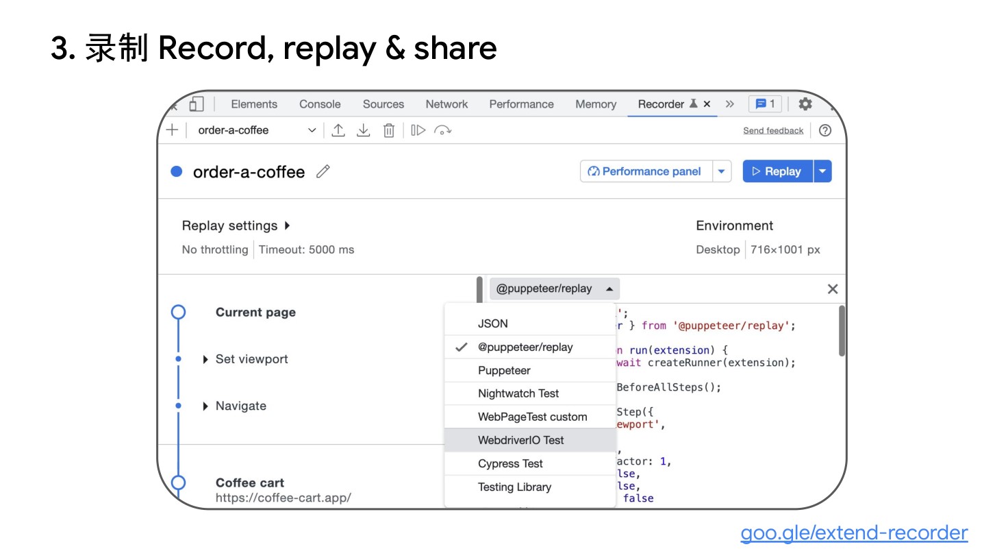
With the Chrome DevTools Recorder panel, you can record and replay user flows. You can export these flows in various formats (such as test scripts) using different third-party extensions and libraries. You can also customize user flows using the Puppeteer Replay library and integrate them into your existing workflow.

In this blog post, we’ll discuss:

  • How to programmatically export and replay user flows.
  • How to customize user flows with Puppeteer Replay.
  • How to integrate with your CI/CD workflow.

Watch the video for a practical demonstration.

Programmatically Exporting User Flows and Replaying

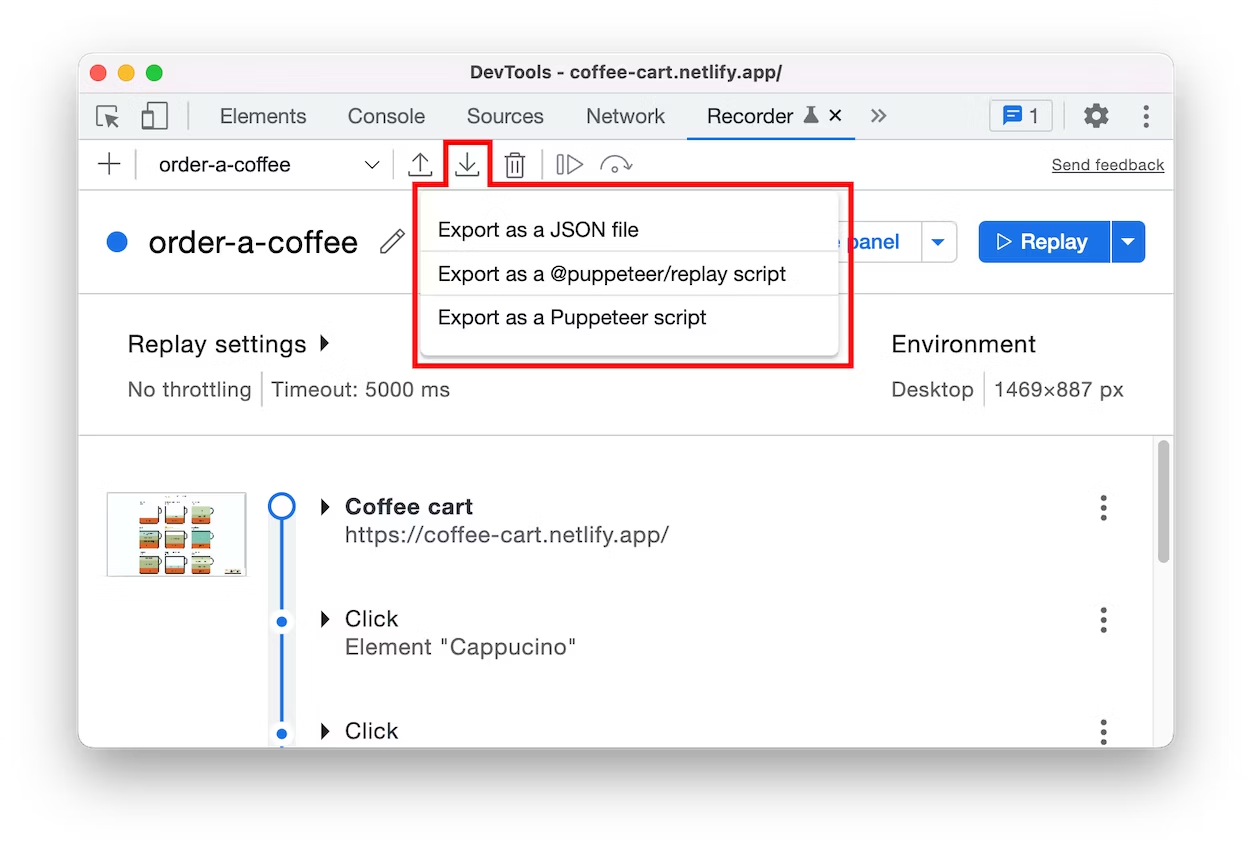
By default, the Recorder allows you to export recordings as Puppeteer or Puppeteer Replay scripts or as pure JSON files.

ModernWeb

Replaying with Puppeteer Replay

After exporting the user flow as a JSON file, you have the option to import it back into the Recorder panel and replay it or use external libraries for replay. One such available library is Puppeteer Replay.

Replaying with Puppeteer Replay

Puppeteer Replay is a library that helps you replay user flows. It’s based on Puppeteer and allows you to replay user flows in the browser without writing any code. You can use Puppeteer Replay to replay your user flows to ensure that your application performs well in different environments.

Integration with CI/CD Pipeline

There are various ways to achieve this, and several tools can be used. Here’s an example of automating this process using GitHub Actions:

# .github/node.js.yml

name: Replay recordings

on:
  push:
    branches: [ "main" ]
  schedule:
    - cron: '30 12 * * *' # daily 12:30pm

jobs:
  build:

    runs-on: ubuntu-latest

    steps:
    - uses: actions/checkout@v3
    - name: Use Node.js
      uses: actions/setup-node@v3
      with:
        node-version: 18.x
        cache: 'npm'
    - run: npm install puppeteer
    - run: npm run replay-all
    - run: npm run start

In this example, we replay the user flow under the following conditions:

  • New changes are pushed to the main branch.
  • Daily at 12:30 PM.

In addition to GitHub Actions, you can also integrate this with your preferred cloud provider.